Components
Since the SDK has a pre-designed interface, it was built using composition. This means that each small part of the interface is a component with its own logic, style, and behavior. This approach ensures that our SDK provides a high level of customization, allowing you to style any component or even remove it entirely.
Below, we will go through each component, demonstrating its default appearance, where it is used, and which properties can be customized.
TranslationWindow
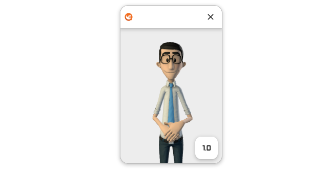
This is the main component of the application. It serves as a container for the 3D avatar and other components. By default, it is draggable.
Customization
This component allows customization of:
- Background Color;
- Width;
- Height;
- Border;
- Shadow;
- Layout;
- Draggability;
- Positioning.
To see the exact properties available for customization via an SDK method, select one of the links below:
Widget
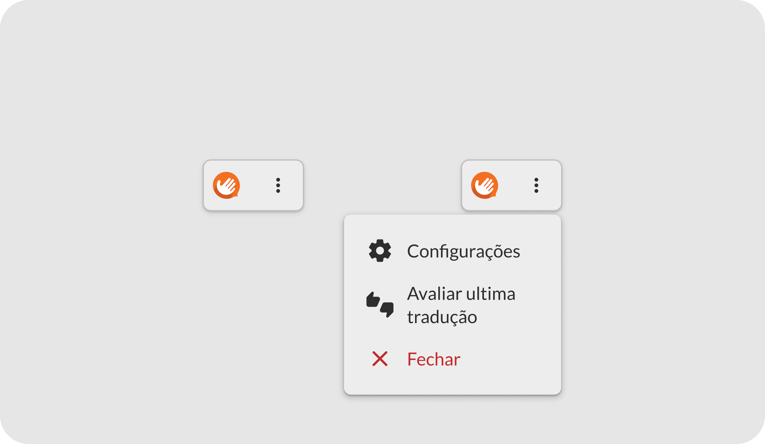
This component represents the translation window when minimized. By default, it is draggable and includes an action menu allowing users to close the application and review the last translation.
Customization
This component allows customization of:
- Background Color;
- Icon and Text Color;
- Close Button Color;
- Border;
- Shadow;
- Complete Removal.
To see the exact properties available for customization via an SDK method, select one of the links below:
Header
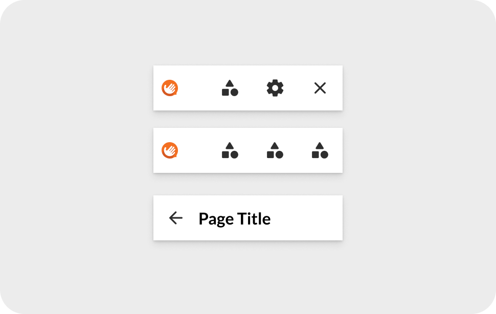
This component is located at the top of the translation window and is displayed whenever the application is ready and waiting for a new translation. It contains the company logo and a close button. It can also appear in internal settings, featuring a back button and a title.
Customization
This component allows customization of:
- Background Color;
- Text Color;
- Border;
- Shadow;
- Complete Removal.
To see the exact properties available for customization via an SDK method, select one of the links below:
Caption
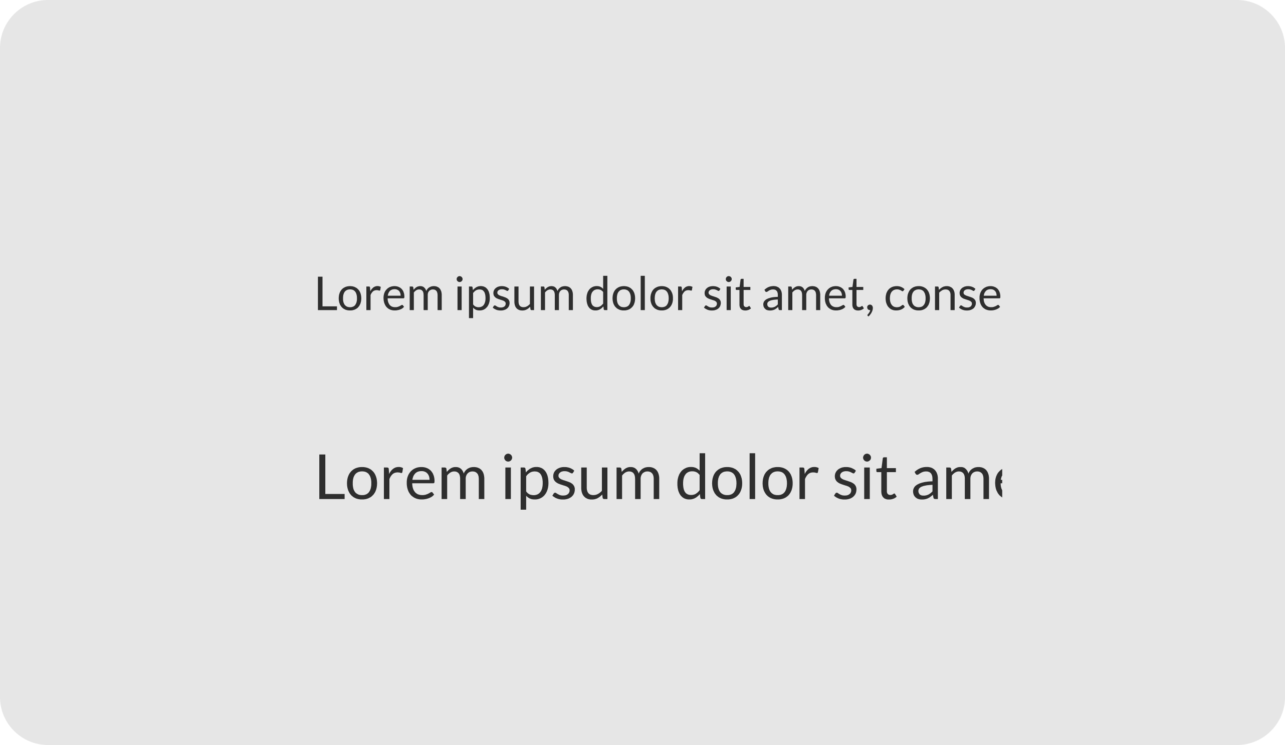
This auxiliary caption component appears at the top of the translation window when signing is in progress. It displays the exact text being translated at that moment.
Customization
This component allows customization of:
- Text Color;
- Font Size;
- Complete Removal.
To see the exact properties available for customization via an SDK method, select one of the links below:
LoadingSpinner
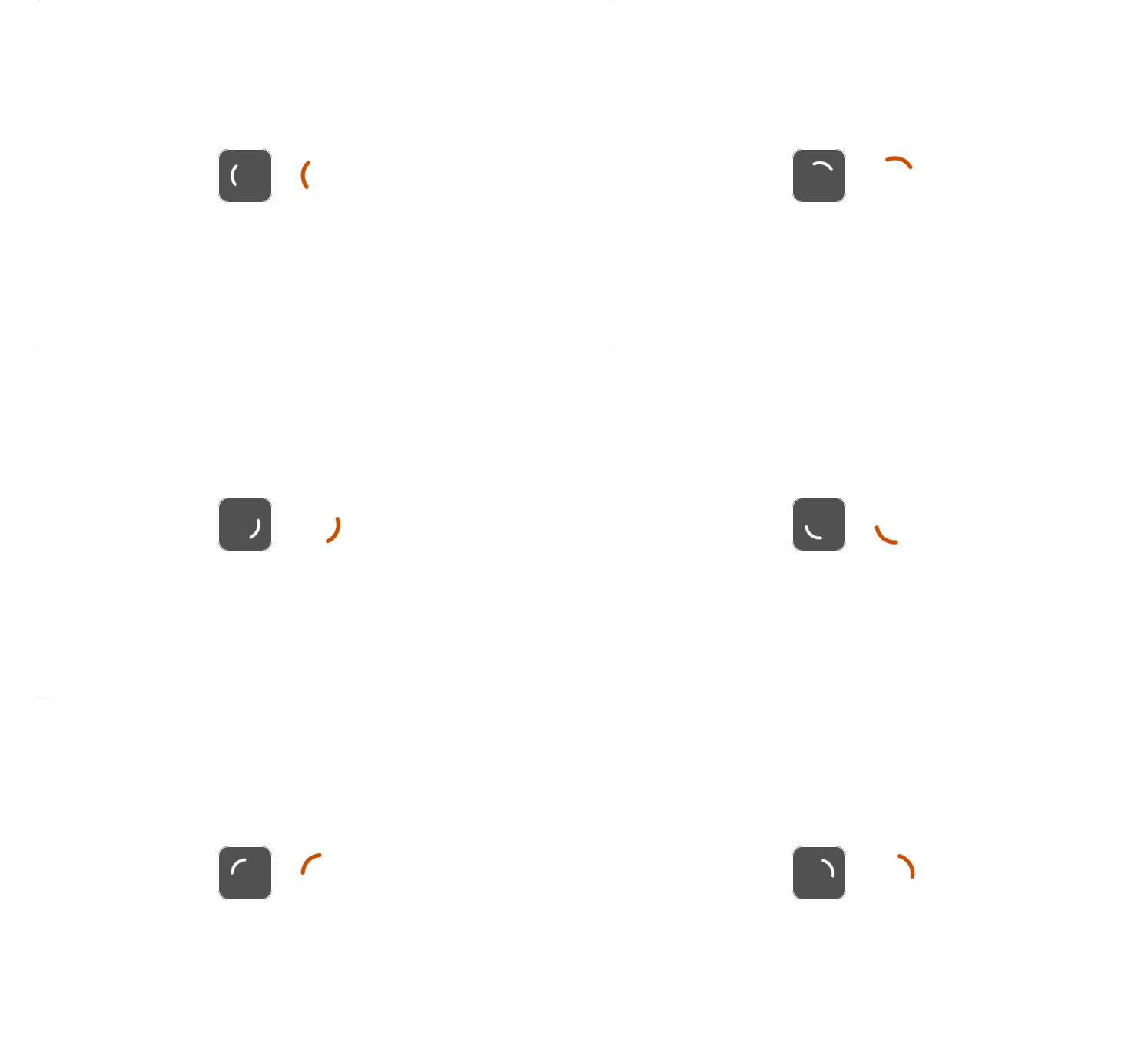
This component represents the translation window's loading indicator. It has two modes: internal, when fetching a translation, and external, when loading the SDK's initial data.
Customization
This component allows customization of:
- Internal
- Spinner Color;
- Background Color;
- Border;
- External
- Spinner Color.
To see the exact properties available for customization via an SDK method, select one of the links below:
IconButton
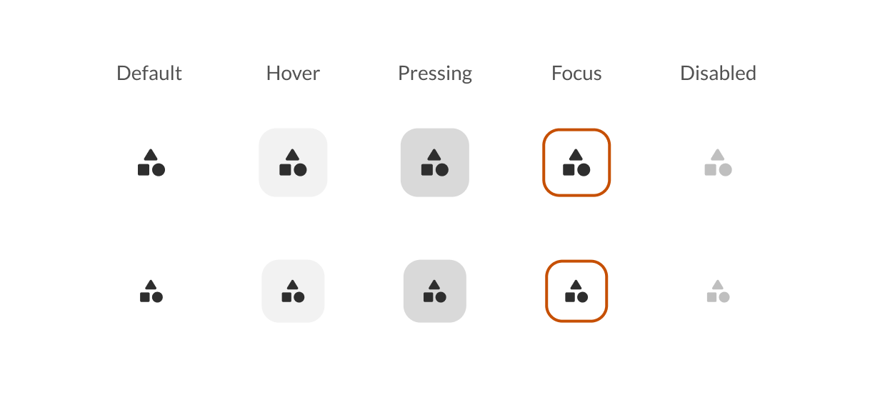
This component represents all icon buttons used in the application. They can be used directly in the interface or inside an IconButtonContainer.
Customization
This component allows customization of:
- Text Color;
- Background Color on Hover;
- Background Color on Click;
- Background Color on Focus;
- Border Radius;
- Complete Removal (Feature-Dependent).
To see the exact properties available for customization via an SDK method, select one of the links below:
IconButtonContainer
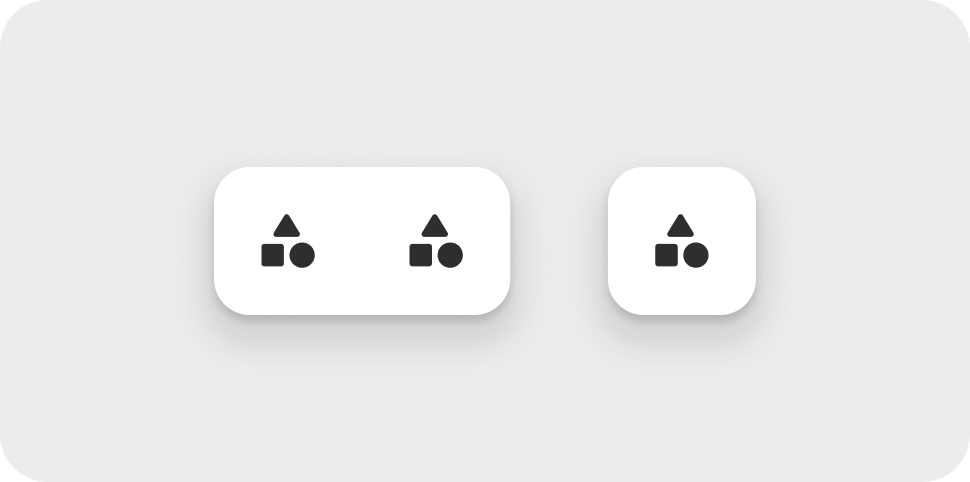
This component acts as a container for IconButton components. It enhances their appearance by adding a background color, shadow, and border. It can hold one or two IconButton elements.
Customization
This component allows customization of:
- Background Color;
- Border;
- Shadow;
- Complete Removal (Feature-Dependent).
To see the exact properties available for customization via an SDK method, select one of the links below:
ErrorMessage
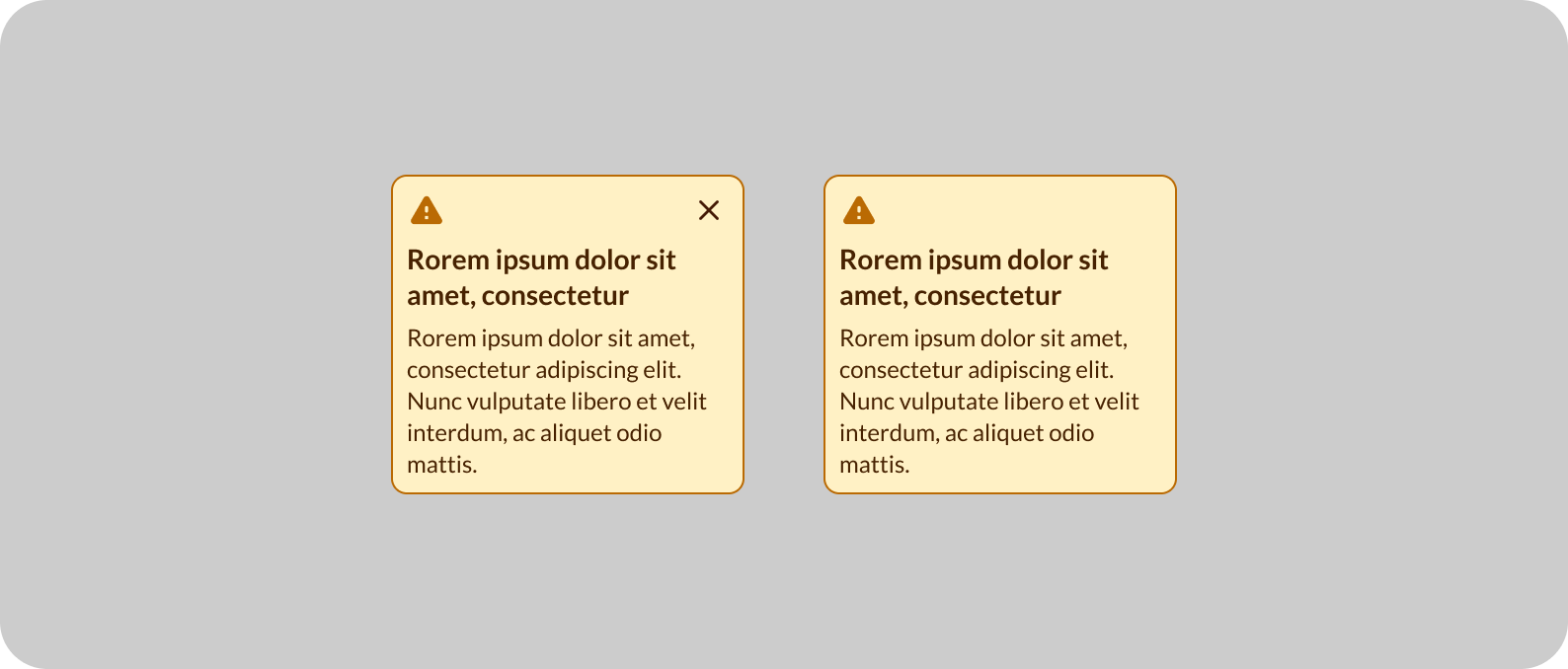
This component displays error messages in the application. It contains a fixed message and may include a button to close the message.
Customization
This component allows customization of:
- Background Color;
- Text Color;
- Icon Color;
- Title Font Size;
- Description Font Size;
- Border;
- Shadow.
To see the exact properties available for customization via an SDK method, select one of the links below:
RateWindow
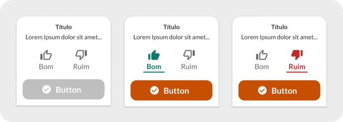
This component serves as an interface for rating translation quality. It can be displayed at the end of a translation that has not yet been rated in the session. It consists of several mini-components, each of which is customizable.
Customization
This component allows customization of:
- Background Color;
- Text Color;
- Icon Color;
- Title Font Size;
- Description Font Size;
- Border;
- Shadow.
To see the exact properties available for customization via an SDK method, select one of the links below:
RateButton
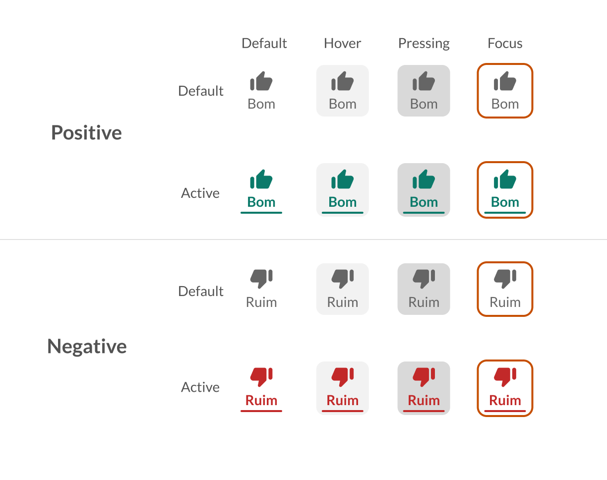
This component is part of the RateWindow and serves as a selector button for translation quality. The available options are Good or Bad.
Customization
This component allows customization of:
- Initial Text and Icon Color;
- Background Color on Hover;
- Background Color on Click;
- Background Color on Focus.
To see the exact properties available for customization via an SDK method, select one of the links below:
Button
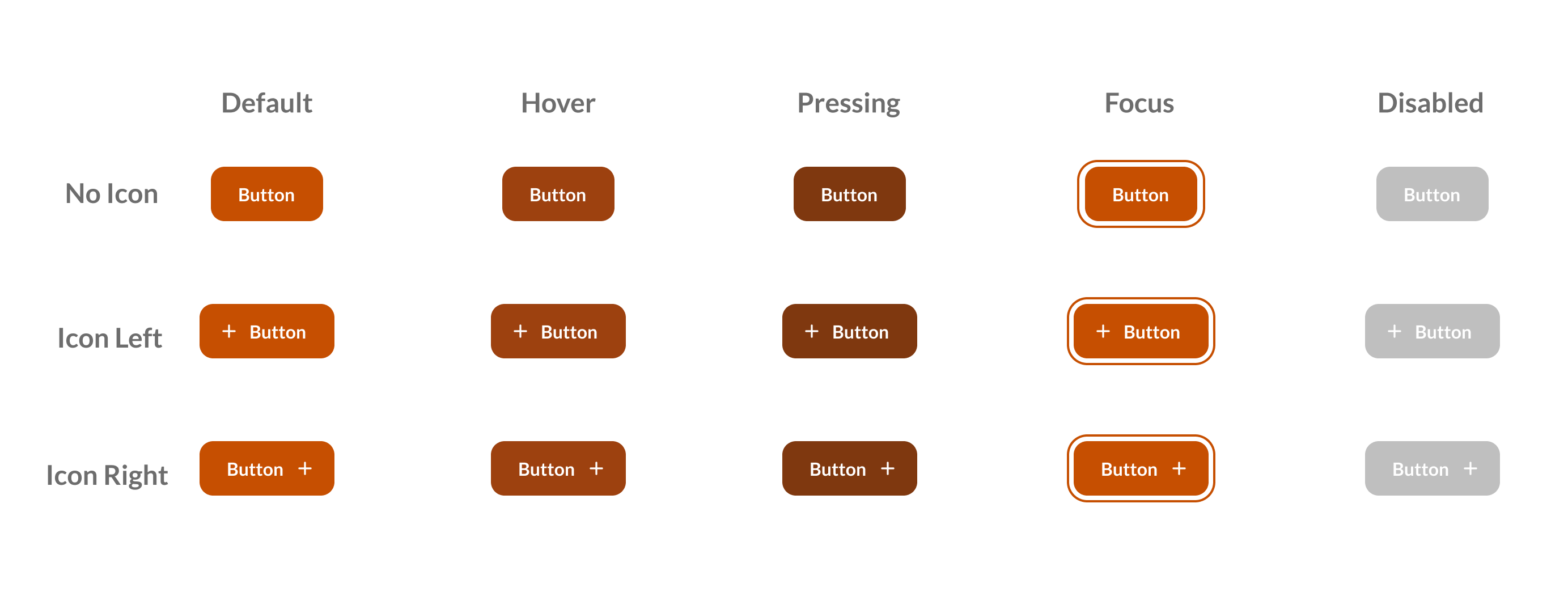
This component is part of the RateWindow and serves as the submit button for the rating.
Customization
This component allows customization of:
- Background Color;
- Text Color;
- Background Color on Hover;
- Background Color on Click;
- Background Color on Focus;
- Border;
- Shadow.
To see the exact properties available for customization via an SDK method, select one of the links below: