Theme
We designed our SDK with a high level of customization in mind, where all UI configurations can be made at runtime through settings using the class constructor or the setConfig method.
In summary, the configuration object has two properties for working with the theme:
theme: Mapped to theIConfigThemetypeenableComponents: Mapped to theIConfigEnableComponentstype
Below, you can see the expanded typing for these two properties.
type BoxShadow = {
	offsetX: string;
	offsetY: string;
	color?: string;
	blur?: string;
	spread?: string;
	inset?: boolean;
};

type Border = {
	width: string;
	color: string;
	style: string;
	radius: string;
};

interface IConfigTheme {
	widget: {
		background: string;
		option: {
			foreground: string;
			hoverBackground: string;
			activeBackground: string;
			focusRingColor: string;
		};
		closeButton: {
			foreground: string;
			hoverBackground: string;
			activeBackground: string;
			focusRingColor: string;
		};
		border: Border;
		shadow: BoxShadow[];
	};

	translationWindow: {
		layout: "relative" | "absolute" | "fixed";
		draggable: boolean;
		position: {
			preset:
				| "topLeft"
				| "top"
				| "topRight"
				| "middleLeft"
				| "middleRight"
				| "bottomLeft"
				| "bottom"
				| "bottomRight"
				| "custom";
			top?: string;
			left?: string;
			right?: string;
			bottom?: string;
		};
		background: string;
		width: string;
		height: string;
		border: Border;
		shadow: BoxShadow[];
	};

	rateWindow: {
		background: string;
		foreground: string;
		titleFontSize: string;
		descriptionFontSize: string;
		border: Border;
		shadow: BoxShadow[];
	};

	loading: {
		internal: {
			color: string;
			background: string;
			border: {
				width: string;
				color: string;
				style: string;
				radius: string;
			};
		};
		external: {
			color: string;
		};
	};

	caption: {
		color: string;
		fontSize: string;
	};

	iconButtonContainer: {
		background: string;
		border: Border;
		shadow: BoxShadow[];
	};

	header: {
		background: string;
		foreground: string;
		border: Border;
		shadow: BoxShadow[];
	};

	button: {
		background: string;
		foreground: string;
		hoverBackground: string;
		activeBackground: string;
		focusRingColor: string;
		border: Border;
		shadow: BoxShadow[];
	};

	rateButton: {
		foreground: string;
		hoverBackground: string;
		activeBackground: string;
		focusRingColor: string;
	};

	iconButton: {
		foreground: string;
		hoverBackground: string;
		activeBackground: string;
		focusRingColor: string;
		border: {
			radius: string;
		};
	};

	errorMessage: {
		background: string;
		foreground: string;
		titleFontSize: string;
		iconColor: string;
		descriptionFontSize: string;
		border: Border;
		shadow: BoxShadow[];
	};
}

interface IConfigEnableComponents {
	changeSpeedButton: boolean;
	pauseAnimationButton: boolean;
	stopAnimationButton: boolean;
	repeatAnimationButton: boolean;
	rateAnimationButton: boolean;
	widget: boolean;
	header: boolean;
	caption: boolean;
	zoom: boolean;
	rotate: boolean;
}
Common Properties
Some properties in certain components are the same and can end up having complex structures. To avoid excessive repetition of large structures, we will present them below:
shadow
- type:
BoxShadow[]
It is an array of objects, where each object has the following properties:
- offsetX:
string - offsetY:
string - blur:
string - spread:
string - color:
string - inset:
boolean
It is used to define multiple shadows on an element.
border
- type:
Border
It is an object with the following properties:
- width:
string - color:
string - style:
string - radius:
string
It is used to define all border properties of an element.
enableComponents
- type:
IConfigEnableComponents - default:
{
	"caption": true,
	"changeSpeedButton": true,
	"header": true,
	"pauseAnimationButton": true,
	"rateAnimationButton": true,
	"repeatAnimationButton": true,
	"stopAnimationButton": true,
	"widget": true,
	"zoom": true,
	"rotate": true
}
This field is used to enable or disable the library components. Each field is optional, and it is not necessary to provide all the values. We recommend using this property if you wish to deactivate the components provided by the library and create your own implementations.
TIP
It's possible to remove all interface elements, with the 3D avatar being the only visible element available, and it cannot be removed.
caption
- type:
boolean - default:
true
Enables or disables the caption during translations.
changeSpeedButton
- type:
boolean - default:
true
Enables or disables the button that changes the translation speed.
header
- type:
boolean - default:
true
Enables or disables the header of the translation window.
pauseAnimationButton
- type:
boolean - default:
true
Enables or disables the button to pause the translation.
rateAnimationButton
- type:
boolean - default:
true
Enables or disables the button to open the rating window, whether through the widget or the translation window.
repeatAnimationButton
- type:
boolean - default:
true
Enables or disables the button to repeat the last translation.
stopAnimationButton
- type:
boolean - default:
true
Enables or disables the button to stop a translation.
widget
- type:
boolean - default:
true
Enables or disables the library widget.
zoom
- type:
boolean - default:
true
Enables or disables the zoom on the avatar.
rotate
- type:
boolean - default:
true
Enables or disables the rotation on the avatar.
theme
- type:
object - default:
{
	"widget": {
		"background": "#EDEDED",
		"border": {
			"color": "#BDBDBD",
			"radius": "12px",
			"style": "solid",
			"width": "1px"
		},
		"option": {
			"foreground": "#2E2E2E",
			"hoverBackground": "#e1e1e1",
			"activeBackground": "#c9c9c9",
			"focusRingColor": "#C64F01"
		},
		"closeButton": {
			"foreground": "#C22929",
			"hoverBackground": "#e1e1e1",
			"activeBackground": "#c9c9c9",
			"focusRingColor": "#C64F01"
		},
		"shadow": [
			{
				"offsetX": "0px",
				"offsetY": "2px",
				"blur": "6px",
				"spread": "2px",
				"color": "rgba(0, 0, 0, 0.15)",
				"inset": false
			},
			{
				"offsetX": "0px",
				"offsetY": "1px",
				"blur": "2px",
				"spread": "0px",
				"color": "rgba(0, 0, 0, 0.08)",
				"inset": false
			}
		]
	},
	"translationWindow": {
		"layout": "fixed",
		"draggable": true,
		"position": {
			"preset": "topRight",
			"top": "",
			"left": "",
			"right": "",
			"bottom": ""
		}
	},
	"loading": {
		"external": {
			"color": "#c64f01"
		},
		"internal": {
			"color": "#FFFFFF",
			"background": "#333333d9",
			"border": {
				"color": "#FFFFFF",
				"width": "0.75px",
				"radius": "10px",
				"style": "solid"
			}
		}
	},
	"caption": { "color": "#2E2E2E2E", "fontSize": "14px" },
	"iconButtonContainer": {
		"background": "#FFFFFF",
		"border": {
			"color": "transparent",
			"radius": "12px",
			"style": "solid",
			"width": "0"
		},
		"shadow": [
			{
				"offsetX": "0px",
				"offsetY": "2px",
				"blur": "6px",
				"spread": "2px",
				"color": "rgba(0, 0, 0, 0.15)",
				"inset": false
			},
			{
				"offsetX": "0px",
				"offsetY": "1px",
				"blur": "2px",
				"spread": "0px",
				"color": "rgba(0, 0, 0, 0.08)",
				"inset": false
			}
		]
	},
	"header": {
		"background": "#FFFFFF",
		"foreground": "#2E2E2E",
		"border": {
			"color": "transparent",
			"radius": "0px",
			"style": "solid",
			"width": "0"
		},
		"shadow": [
			{
				"offsetX": "0px",
				"offsetY": "2px",
				"blur": "6px",
				"spread": "2px",
				"color": "rgba(0, 0, 0, 0.15)",
				"inset": false
			},
			{
				"offsetX": "0px",
				"offsetY": "1px",
				"blur": "2px",
				"spread": "0px",
				"color": "rgba(0, 0, 0, 0.08)",
				"inset": false
			}
		]
	},
	"button": {
		"background": "#c64f01",
		"foreground": "#FFFFFF",
		"hoverBackground": "#b24701",
		"activeBackground": "#9e3f01",
		"focusRingColor": "#c64f01",
		"border": {
			"color": "transparent",
			"radius": "12px",
			"style": "solid",
			"width": "0"
		},
		"shadow": []
	},
	"rateButton": {
		"foreground": "#2E2E2E",
		"hoverBackground": "#e1e1e1",
		"activeBackground": "#c9c9c9",
		"focusRingColor": "#C64F01"
	},
	"iconButton": {
		"foreground": "#2E2E2E",
		"hoverBackground": "#e1e1e1",
		"activeBackground": "#c9c9c9",
		"focusRingColor": "#C64F01",
		"border": {
			"radius": "12px"
		}
	},
	"errorMessage": {
		"background": "#FFF1C5",
		"foreground": "#472201",
		"titleFontSize": "14px",
		"descriptionFontSize": "12px",
		"iconColor": "#BA6A03",
		"shadow": [],
		"border": {
			"color": "#BA6A03",
			"radius": "8px",
			"style": "solid",
			"width": "1px"
		}
	}
}
This field is used to customize the style of the library's elements. Each field is optional, and it is not necessary to provide all values.
widget
background
- Type:
string - Default:
#EDEDED
Defines the background color of the widget and the options menu.
border
- Defaults:
- Width:
1px - Radius:
12px - Style:
solid - Color:
#BDBDBD
- Width:
See the structure of the border field.
option
- Type:
object - Default:
{
	"foreground": "#2E2E2E",
	"hoverBackground": "#e1e1e1",
	"activeBackground": "#c9c9c9",
	"focusRingColor": "#C64F01"
}
Defines the styling of each option within the options menu.
foreground
- Type:
string - Default:
#2E2E2E
Defines the color of the text and icon of the element.
hoverBackground
- Type:
string - Default:
#e1e1e1
Defines the background color of the element when the user hovers over it.
activeBackground
- Type:
string - Default:
#c9c9c9
Defines the background color of the element when the user clicks on it.
focusRingColor
- Type:
string - Default:
#C64F01
Defines the color of the outline of the element when the user has it in focus.
closeButton
- Type:
object - Default:
{
	"foreground": "#C22929",
	"hoverBackground": "#e1e1e1",
	"activeBackground": "#c9c9c9",
	"focusRingColor": "#C64F01"
}
Defines the styling of a specific option in the options menu: Close Application Button.
foreground
- Type:
string - Default:
#C22929
Defines the color of the text and icon of the element.
hoverBackground
- Type:
string - Default:
#e1e1e1
Defines the background color of the element when the user hovers over it.
activeBackground
- Type:
string - Default:
#c9c9c9
Defines the background color of the element when the user clicks on it.
focusRingColor
- Type:
string - Default:
#C64F01
Defines the color of the outline of the element when the user has it in focus.
shadow
- Defaults:
[
	{
		"offsetX": "0px",
		"offsetY": "2px",
		"blur": "6px",
		"spread": "2px",
		"color": "rgba(0, 0, 0, 0.15)",
		"inset": false
	},
	{
		"offsetX": "0px",
		"offsetY": "1px",
		"blur": "2px",
		"spread": "0px",
		"color": "rgba(0, 0, 0, 0.08)",
		"inset": false
	}
]
See the structure of the shadow field.
translationWindow
layout
- type:
"relative" | "absolute" | "fixed" - default:
fixed
Defines how the translation window will be positioned on the page. By default, it is fixed on the screen.
draggable
- type:
boolean - default:
true
Defines whether the translation window (and the widget) can be dragged.
position
- type:
object - default:
{
	"preset": "topRight",
	"top": "",
	"left": "",
	"right": "",
	"bottom": ""
}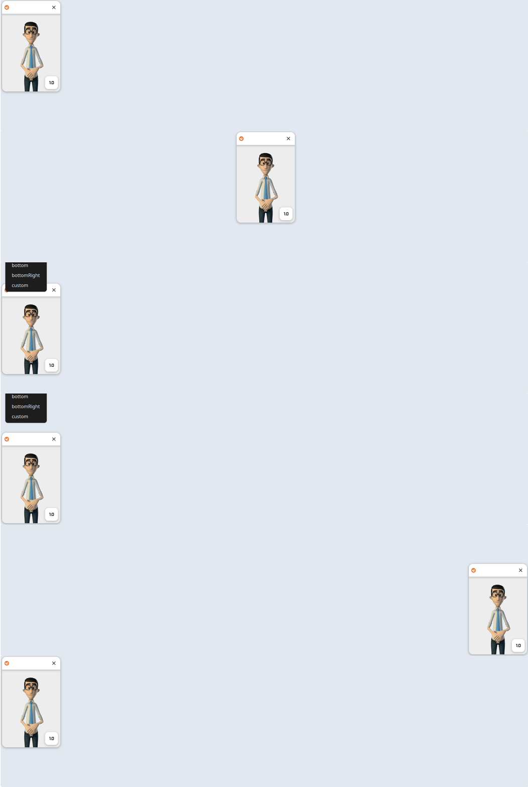
Property that defines the position of the translation window relative to the parent element. By default, the window is positioned at the top-right corner. It is possible to use positioning presets and/or directly define the top, left, right, and bottom coordinates.
- presets:
"topLeft" | "top" | "topRight" | "middleLeft" | "middleRight" | "bottomLeft" | "bottom" | "bottomRight" | "custom"
Each preset will position the element in one of the 8 positions, and they can be used in conjunction with the top, left, right, and bottom fields, which will override the positions set by the presets.
If you do not want to use any preset and only define the top, left, right, and bottom fields, simply set the preset to custom.
background
- type:
string - default:
#EDEDED
Defines the background color of the translation window.
width
- type:
string - default:
200px
Defines the width of the translation window.
height
- type:
string - default:
310px
Defines the height of the translation window.
border
- Defaults:
- width:
1px - radius:
16px - style:
solid - color:
#BDBDBD
- width:
Defines the border of the translation window.
See the structure of the border field.
shadow
- Defaults:
[
	{
		"offsetX": "0px",
		"offsetY": "2px",
		"blur": "6px",
		"spread": "2px",
		"color": "rgba(0, 0, 0, 0.15)",
		"inset": false
	},
	{
		"offsetX": "0px",
		"offsetY": "1px",
		"blur": "2px",
		"spread": "0px",
		"color": "rgba(0, 0, 0, 0.08)",
		"inset": false
	}
]
Defines the shadow of the translation window.
See the structure of the shadow field.
rateWindow
This component serves as an interface for evaluating the quality of translations and it's possible to display it always after a translation that has not been evaluated in the session. It is composed of other mini-components that also have customization.
background
- type:
string - default:
#FFFFFF
Defines the background color of the element.
foreground
- type:
string - default:
#2E2E2E
Defines the color of the internal textual elements.
titleFontSize
- type:
string - default:
12px
Defines the font size of the title of the element.
descriptionFontSize
- type:
string - default:
12px
Defines the font size of the description of the element.
border
- Defaults:
- width:
0 - radius:
16px 16px 0 0 - style:
solid - color:
#000
- width:
See the structure of the border field.
shadow
- Defaults:
[
	{
		"offsetX": "0px",
		"offsetY": "2px",
		"blur": "6px",
		"spread": "2px",
		"color": "rgba(0, 0, 0, 0.15)",
		"inset": false
	},
	{
		"offsetX": "0px",
		"offsetY": "1px",
		"blur": "2px",
		"spread": "0px",
		"color": "rgba(0, 0, 0, 0.08)",
		"inset": false
	}
]
See the structure of the shadow field.
loading
The loading component is divided into internal and external.
- external: Used to load the initial data of the SDK.
- internal: Used between translations.
internal
- type:
object - default:
{
	"color": "#FFFFFF",
	"background": "#333333d9",
	"border": {
		"color": "#FFFFFF",
		"width": "0.75px",
		"radius": "10px",
		"style": "solid"
	}
}
Defines how the loading between translations should be customized.
color
- type:
string - default:
#FFFFFF
Defines the color of the rotating spinner.
background
- type:
string - default:
#333333d9
Defines the background color of the rotating spinner.
border
- Defaults:
- width:
0.75px - radius:
10px - style:
solid - color:
#FFFFFF
- width:
See the structure of the border field.
external
- type:
object - default:
{
	"color": "#FFFFFF"
}
Defines how the loading for initial SDK data loading should be customized.
color
- type:
string - default:
#FFFFFF
Defines the color of the rotating spinner.
caption
The component for the caption of the current translation.
color
- type:
string - default:
#2E2E2E2E
Defines the text color of the caption.
fontSize
- type:
string - default:
14px
Defines the font size of the caption.
iconButtonContainer
The container component for the IconButton components.
background
- type:
string - default:
#FFFFFF
Defines the background color of the element.
border
- Defaults:
- width:
0 - radius:
12px - style:
solid - color:
transparent
- width:
See the structure of the border field.
shadow
- Defaults:
[
	{
		"offsetX": "0px",
		"offsetY": "2px",
		"blur": "6px",
		"spread": "2px",
		"color": "rgba(0, 0, 0, 0.15)",
		"inset": false
	},
	{
		"offsetX": "0px",
		"offsetY": "1px",
		"blur": "2px",
		"spread": "0px",
		"color": "rgba(0, 0, 0, 0.08)",
		"inset": false
	}
]
See the structure of the shadow field.
header
The application's header component, appearing during the ready state.
background
- type:
string - default:
#FFFFFF
Defines the background color of the element.
foreground
- type:
string - default:
#2E2E2E
Defines the color of internal textual elements.
border
- Defaults:
- width:
0 - radius:
0 - style:
solid - color:
transparent
- width:
See the structure of the border field.
shadow
- Defaults:
[
	{
		"offsetX": "0px",
		"offsetY": "2px",
		"blur": "6px",
		"spread": "2px",
		"color": "rgba(0, 0, 0, 0.15)",
		"inset": false
	},
	{
		"offsetX": "0px",
		"offsetY": "1px",
		"blur": "2px",
		"spread": "0px",
		"color": "rgba(0, 0, 0, 0.08)",
		"inset": false
	}
]
See the structure of the shadow field.
button
This component is part of the RateWindow and serves as the submit button for the rating.
background
- type:
string - default:
#c64f01
Defines the background color of the element.
hoverBackground
- type:
string - default:
#b24701
Defines the background color of the element when the user hovers over it.
activeBackground
- type:
string - default:
#9e3f01
Defines the background color of the element when the user clicks on it.
focusRingColor
- type:
string - default:
#c64f01
Defines the outline color of the element when the user focuses on it.
border
- Defaults:
- width:
0 - radius:
12px - style:
solid - color:
transparent
- width:
See the structure of the border field.
shadow
- Defaults:
[]See the structure of the shadow field.
rateButton
This component is part of the RateWindow and serves as the button to select whether the quality of the evaluation was good or bad.
foreground
- type:
string - default:
#2E2E2E
Defines the text and icon color of the element when it is not yet selected.
hoverBackground
- type:
string - default:
#e1e1e1
Defines the background color of the element when the user hovers over it.
activeBackground
- type:
string - default:
#c9c9c9
Defines the background color of the element when the user clicks on it.
focusRingColor
- type:
string - default:
#C64F01
Defines the outline color of the element when the user focuses on it.
iconButton
This component represents all the icon buttons that appear in the application. They can be used directly in the interface or can be inside an IconButtonContainer.
foreground
- type:
string - default:
#2E2E2E
Defines the icon color of the element.
hoverBackground
- type:
string - default:
#e1e1e1
Defines the background color of the element when the user hovers over it.
activeBackground
- type:
string - default:
#c9c9c9
Defines the background color of the element when the user clicks on it.
focusRingColor
- type:
string - default:
#C64F01
Defines the outline color of the element when the user focuses on it.
border.radius
- type:
string - default:
12px
For this element, only the border radius is allowed.
errorMessage
This component is used to display error messages in the application. It has a fixed message and can contain a button to close the message.
background
- Type:
string - Default:
#FFF1C5
Defines the background color of the element.
foreground
- Type:
string - Default:
#472201
Defines the color of the text of the element.
titleFontSize
- Type:
string - Default:
14px
Defines the font size of the title of the element.
descriptionFontSize
- Type:
string - Default:
12px
Defines the font size of the description of the element.
iconColor
- Type:
string - Default:
#BA6A03
Defines the color of the icon of the element.
border
- Defaults:
- Width:
1px - Radius:
8px - Style:
solid - Color:
#BA6A03
- Width:
See the structure of the border field.
shadow
- Defaults:
[]See the structure of the shadow field.